I don't really need to give reasons as to "why" data visualization is necessary, everyone knows that a graph is easier to look at and understand than a large table.
People most likely get their first introduction to plotting in Excel, when they highlight a table or column, press the chart button and out pops a chart. Easy, right?
Well, once people get introduced to a programming language such as Python that doesn't have the 'clicky buttons' to make the charts, the task can seem somewhat daunting.
It's actually not as bad as one would initially think; below are some code snippets to get started.
Plotting using Pandas
This post will focus on plotting using Pandas DataFrames, since that's the easiest way to generate results.
Let's say you have the following DataFrame (which I just made up right now):
import pandas as pd
import matplotlib.pyplot as plt

school_dat = pd.DataFrame(
    [[11, 25, 3, 6], [12, 5, 1, 7], [13, 40, 7, 7], [10, 10, 3, 5]],
    index=['Alice', 'Bob', 'Claire', 'Daniel'],
    columns=['age', 'minutes_to_school', 'distance_to_school', 'class'])
        age  minutes_to_school  distance_to_school  class
Alice    11                 25                   3      6
Bob      12                  5                   1      7
Claire   13                 40                   7      7
Daniel   10                 10                   3      5
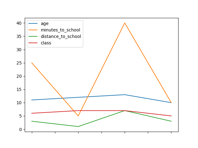
What's great about pandas is that it contains plotting methods within the DataFrame object. You just need to include import matplotlib.pyplot as plt so if you're running this in console, you run plt.show() to actually show the plot.
The following code:
school_dat.plot()
plt.show()
Will result in a line chart plot, like so:
Using within a Jupyter notebook
If you're instead running the code in a Jupyter notebook, you want to add the following line at the top with your imports:
%matplotlib inline
This ensures that the plots will be shown as output from the cells.
Similarly, when running in Jupyter you'll see something similar to <matplotlib.axes._subplots.AxesSubplot object at 0x1130e59e8> above the chart. That just shows the memory location of the plot object. It's a bit ugly, so the easy workaround to get rid of it is to assign the plot method call to a variable like so:
my_plot = school_dat.plot()
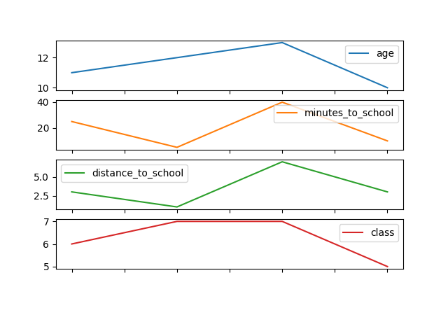
Changing the Plot Around
Now, it's nice how quickly we generated the plot, but there may be other options we want to use. For one, let's say we wanted to view the lines on different plots?
For that we would run:
my_plot = school_dat.plot(subplots=True)
Don't forget to run plt.show() if necessary!
We would get a figure like so:
Still, however, this data is better suited as bar charts, since the lines imply that the data is connected somehow, while it's really not. If the x-axis implied some order, such as time, then a line chart might be a good choice, but now counts of numbers is more useful for what we might be interested in. A bar chart is a good choice for this type of data.
my_plot = school_dat.plot.bar()
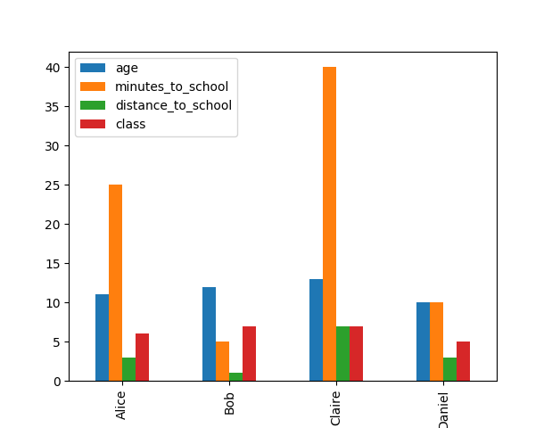
There are many options for different charts, they can be found in the kind parameter in the DataFrame.plot documentation. I could have also called the above barchart as school_dat.plot(kind='bar'), but I feel using it as a method call above looks cleaner.
This is a good use case to break out the subplots, since I think it's more interesting to compare individual attributes across students than grouping all the attributes for each student.
my_plot = school_dat.plot.bar(subplots=True)
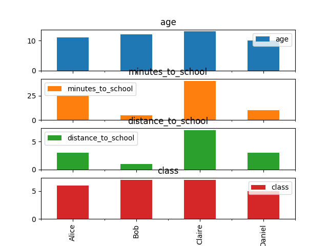
Unfortunately the subplot titles get in the way, to remove them we can pass a list of empty strings. The list needs to be the same size as the number of columns in the DataFrame, since each column is getting its own subplot.
num_cols=school_dat.shape[1]
my_plot = school_dat.plot.bar(subplots=True, title=['']*num_cols)

I think this is a good start to an insightful visualization for this type of data.
The examples here are obviously only the tip of the iceberg as to what can be done with these plot methods; be sure to check out the official documentation for DataFrame.plot to see what other options are available.
Comments